Capucine et Tournesol is a local Montréal bakery and mill whose existing website was outdated, difficult to navigate and had poor accessibility.
This project involved a complete redesign and rebuild of the website to create a clear, intuitive, and accessible experience. The site was intentionally rebuilt for performance and sustainability, and now achieves perfect Lighthouse scores and an A+ Website Carbon rating.
Challenge & Goals
The existing site presented several key challenges that affected navigation, content clarity, and overall usability, including a lack of mobile responsiveness, missing metadata, and long, unstructured content that was difficult to find. The focus of the redesign was to resolve these issues while also introducing new goals around performance, sustainability, and long-term maintainability.
The redesign aimed to:
Restructure the site's information architecture to improve hierarchy and navigation.
Improve readability of long-form content.
Implement accessibility standards, SEO compliance, and full mobile responsiveness across devices.
Apply Web Sustainability Guidelines (WSG) across design and development.
Strengthen branding and deliver a fully bilingual site in both English and French.
Build a lightweight, low-maintenance, user-friendly custom CMS that leverages Markdown for text content editing.
Process
Information Architecture & Content Strategy
I first conducted a full content audit and consolidated 10 disconnected navigation items into five logical categories. Information-heavy pages were unified under a new “Info & Insights” hub with sticky internal navigation for quick scanning and anchoring. The resulting architecture balanced content depth with usability, enabling easy exploration of products, business narrative, and industry insights without cognitive overload.
Design & UI
The visual design draws inspiration from the bakery’s existing branding, including its bread packaging labels, alongside an aesthetic suited to an organic, handcrafted identity. Custom typography for the logo and headings was chosen to reflect this branding. Typographic hierarchy, spacing, and styles were refined to make product-related content scannable and long-form text readable.
Navigation was simplified, with a fixed header and anchored headings enabling easy access between and within pages. On mobile, a CSS-only menu was added, and scrollable horizontal tabs were used to maintain a solid user flow.
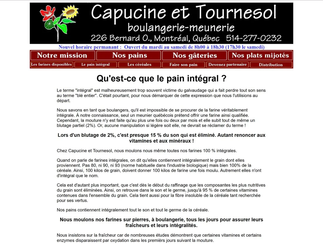
│↑│ Before: Original design with cluttered navigation and dense text blocks.
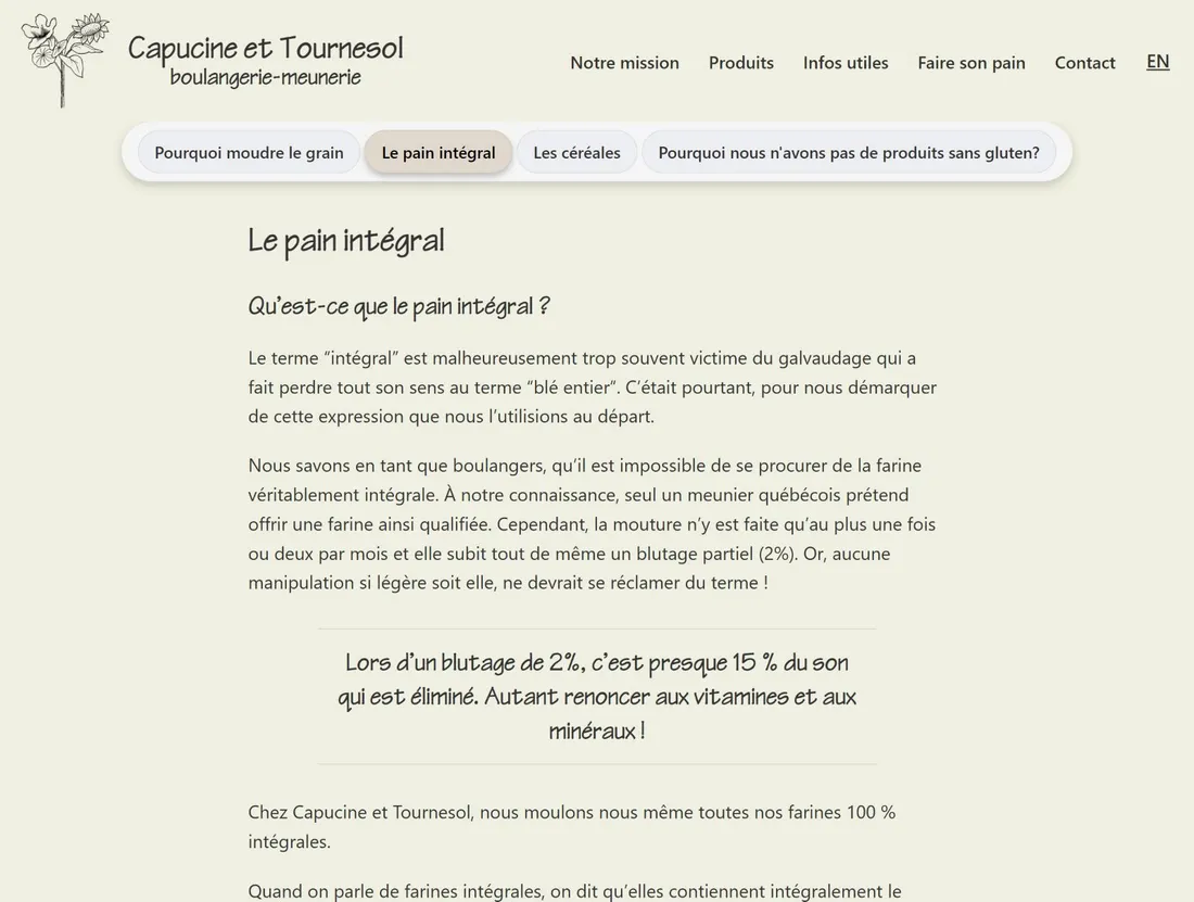
│↑│ After: Redesigned interface with new information architecture, improved readability, and brand-aligned styling.
Sustainable Design Methodology
Both design and technical decisions in this rebuild were guided by the
Web Sustainability Guidelines (WSG), with the goal of reducing energy use, data transfer, and long-term resource consumption.
The result was a site built with lightweight HTML and CSS, using minimal JavaScript (≈3%). Many interactions—including navigation, scrolling behavior, and menu states—were implemented using CSS rather than scripts to reduce client-side processing.
Key Decisions:
Built with Astro (SSG) and hosted on GitHub Pages to serve efficient static pages, avoiding server-side processing.
Avoided heavy animations, optimized assets using modern formats (WebP), and leveraged system fonts alongside clear typographic hierarchy to reduce data transfer.
Separated content from layout using Markdown and JSON, and implemented a lightweight GitHub-based CMS panel to allow updates and long-term maintainability without external dependencies.
Accessibility & SEO
Implemented semantic HTML, descriptive alt text, clear focus states, and appropriate ARIA patterns aligned with WCAG 2.1 AA.
Ensured bilingual structure (/fr/ and /en/) with canonical and hreflang tags, structured data, sitemap, and clean URLs to improve discoverability for both language audiences.
Outcome
The redesigned site demonstrates how strong information architecture and sustainable build methods contribute to long-term usability, reduce environmental impact, and add practical value for a small business.