Product Research & Definition
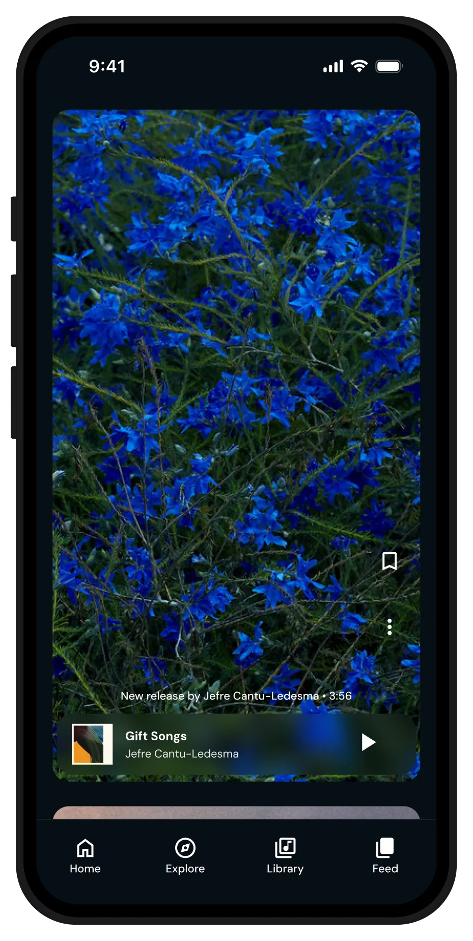
A competitor analysis of major and niche music apps helped identify UI conventions to retain or evolve — such as expandable players, swipeable feeds, and persistent audio controls.
Early usability testing revealed ambiguity around audience and intent, leading to refined hero content and clearer visual hierarchy. This clarified the app’s focus on listeners, moving away from a dual creator–listener model.
Design System
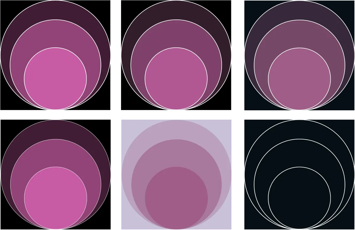
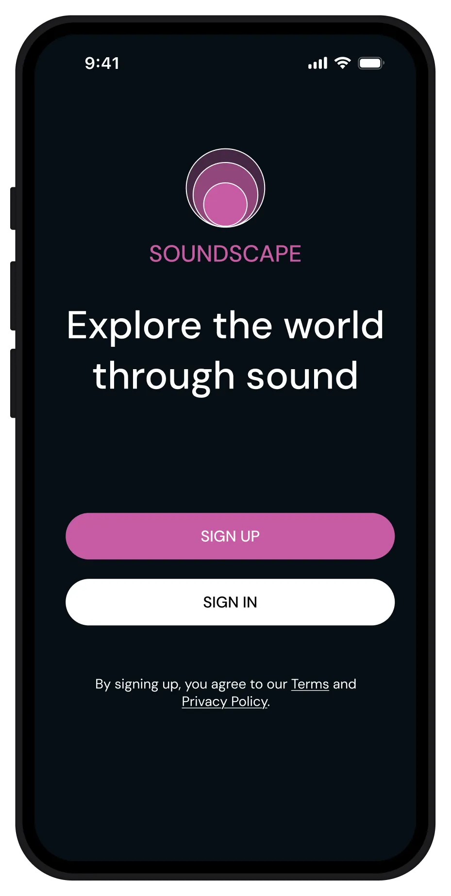
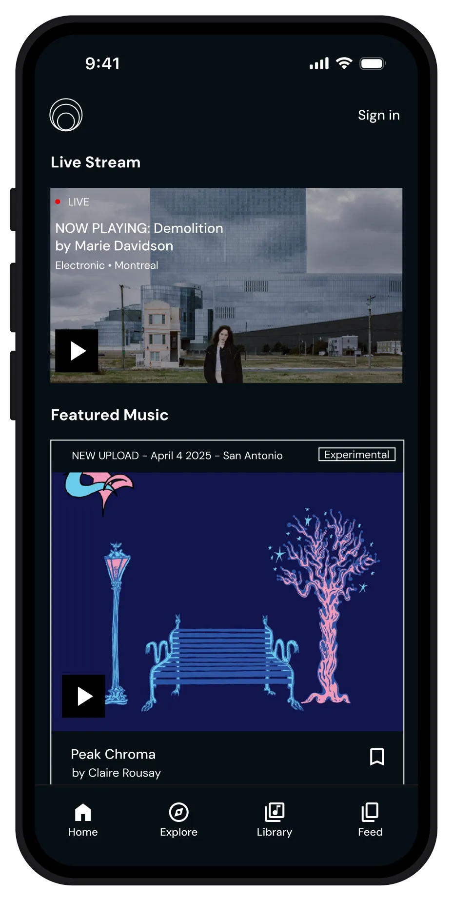
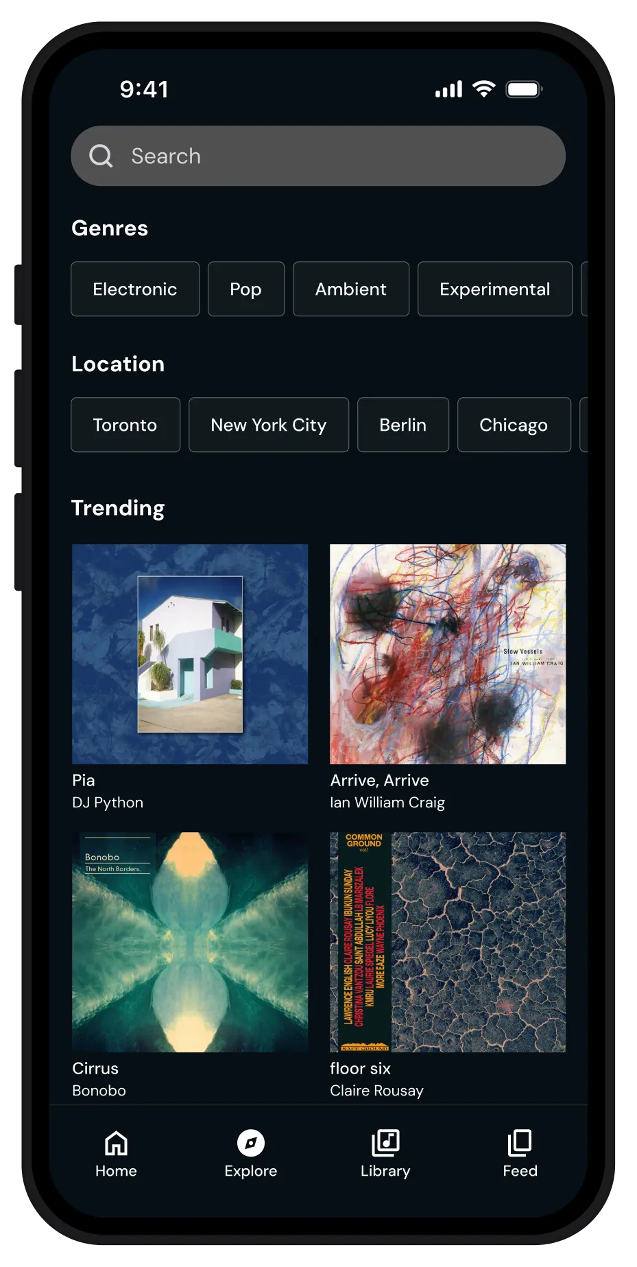
A modular Figma UI kit was developed, including typography, color palette, components, and iconography. The interface uses a deep blue-black background with a restrained accent color to guide interaction. DM Sans supports clarity and typographic hierarchy across screens.
Layouts follow a consistent grid system to maintain rhythm and balance, emphasizing album artwork and genre tags without clutter. Spacing, tap targets, and color contrast adhere to accessibility standards and Apple’s Human Interface Guidelines.
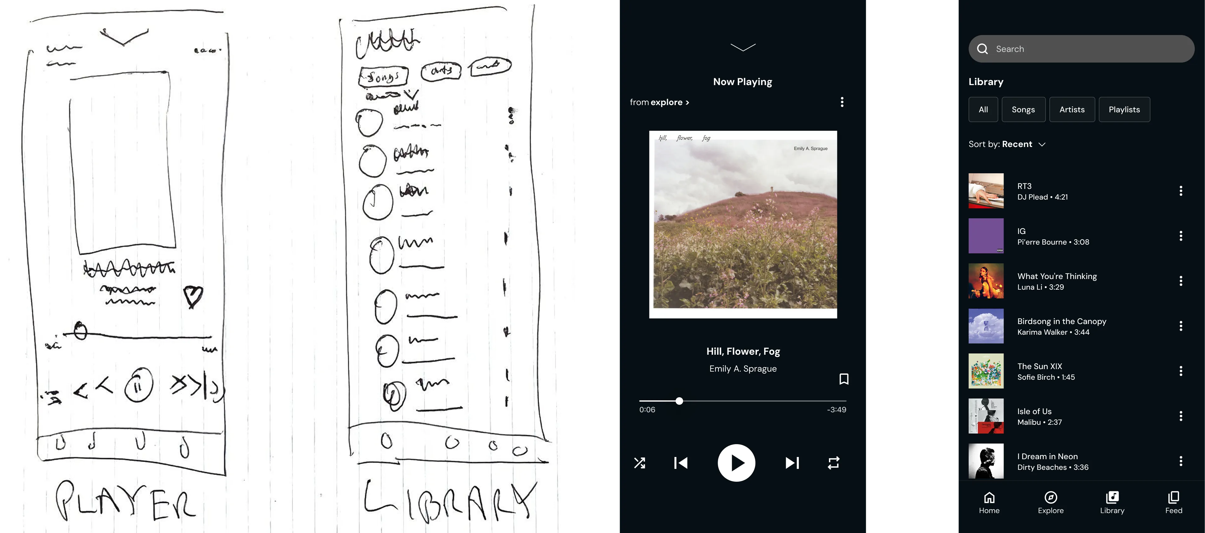
User Flow & Interaction Design
The app was structured around three discovery modes — Explore, Stream, and Feed. Informed by competitive patterns, the interaction design focused on a familiar playback experience with intuitive controls and a clear flow between browsing and listening.